
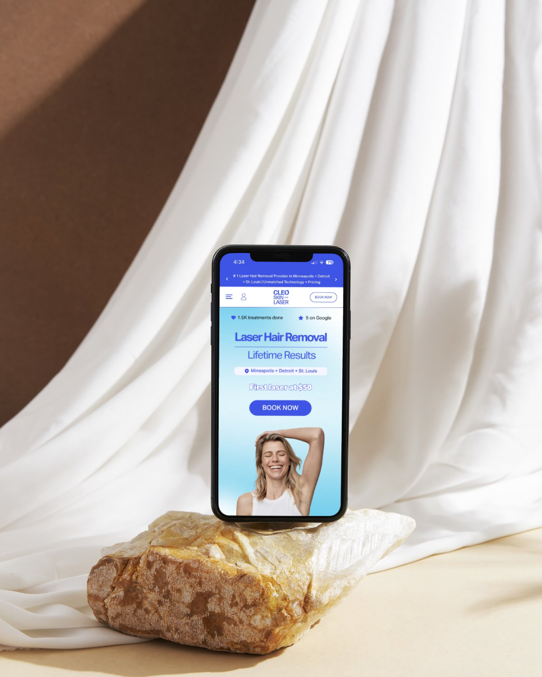
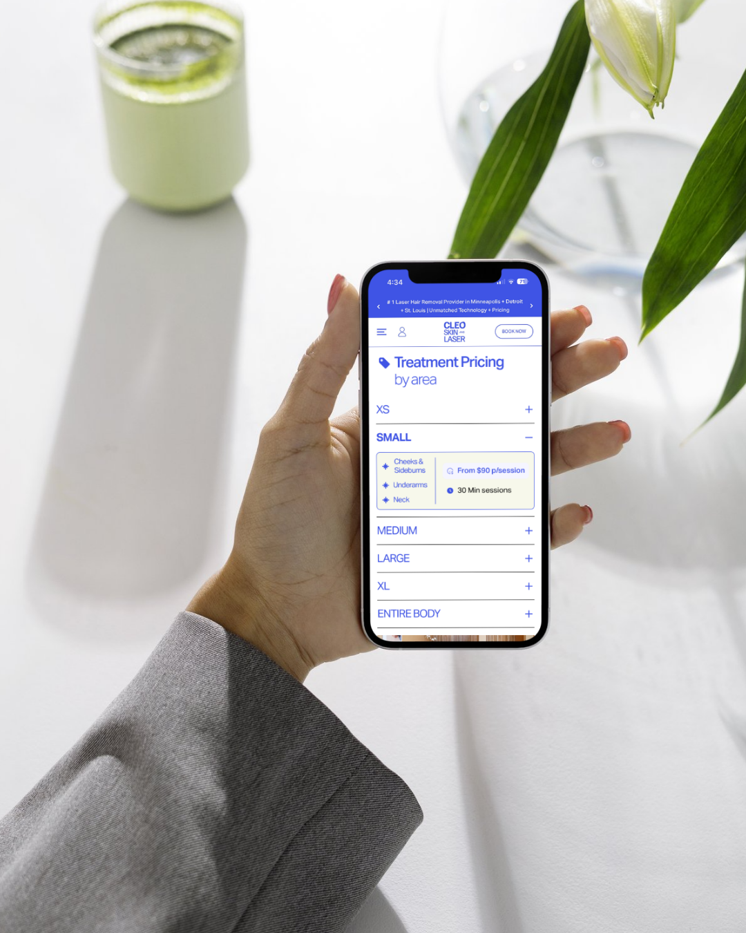

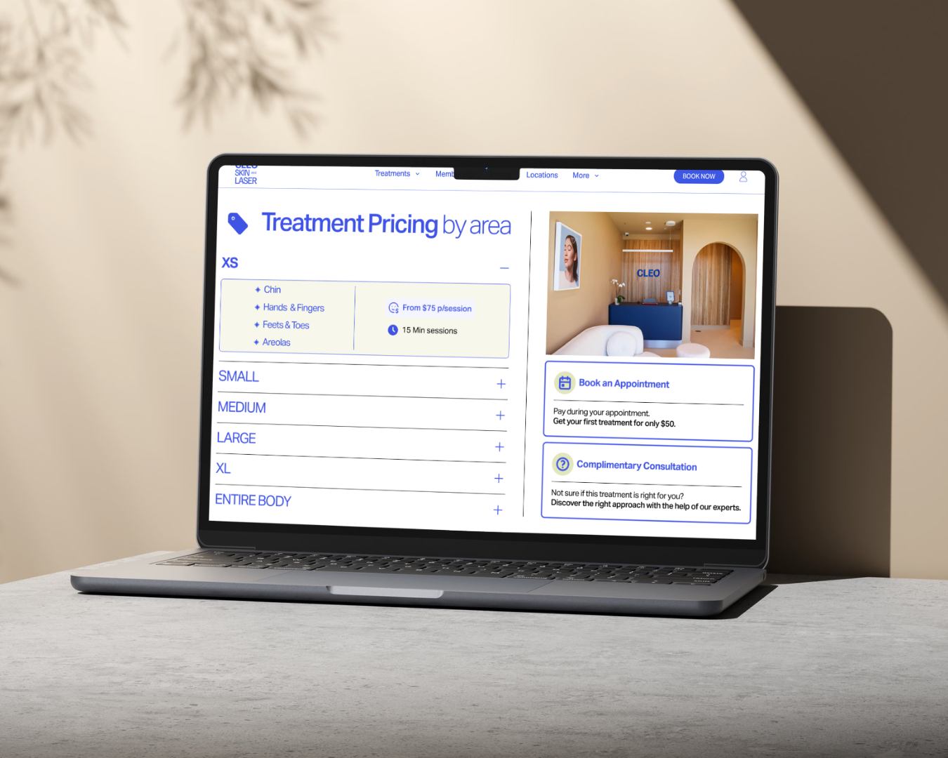
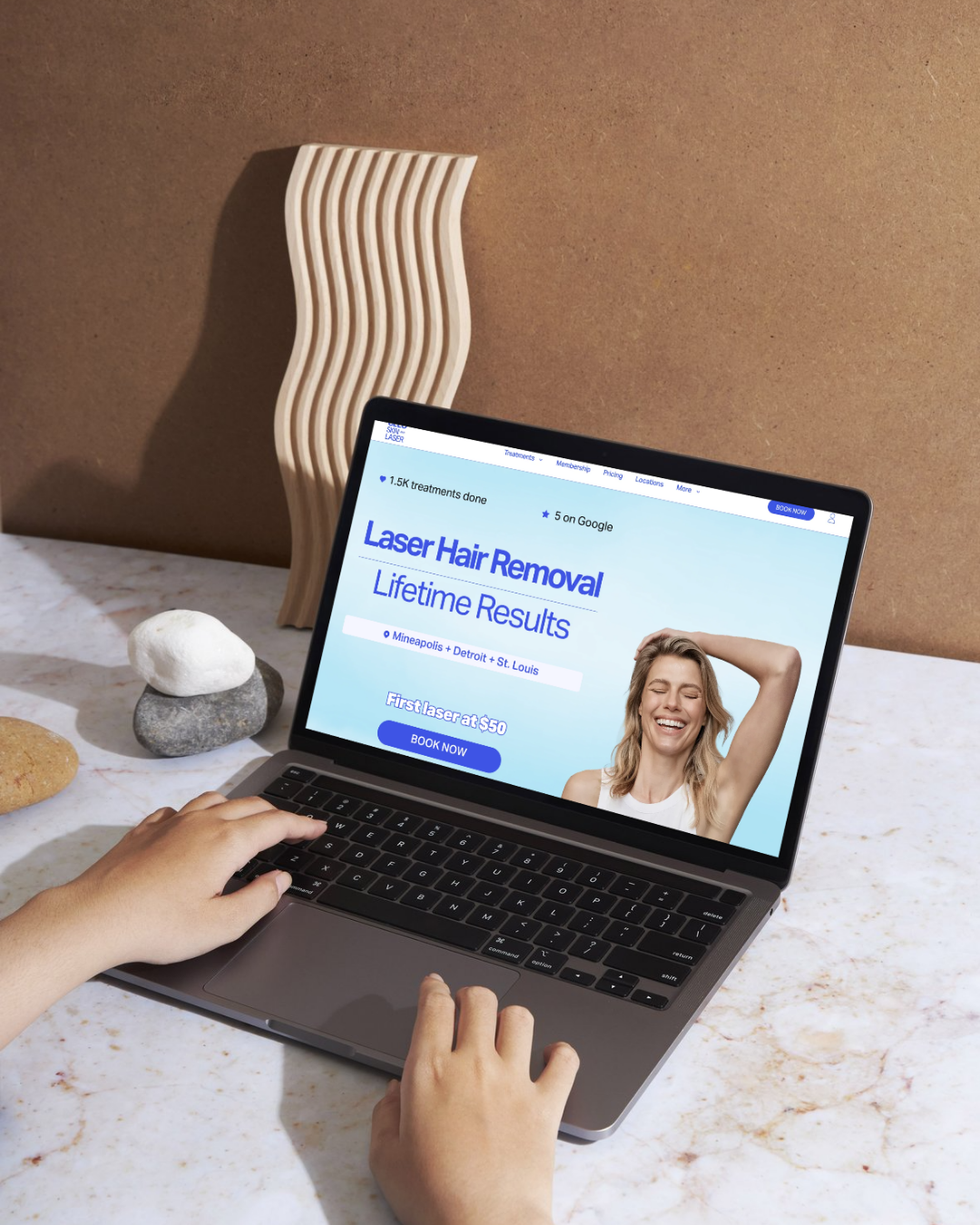
This project focused on redesigning the Laser Hair Removal pricing and treatment section to improve usability, clarity, and conversion performance.
The redesign was centered on optimizing the user journey for users who had already expressed strong intent to book or learn more about the treatment.
As the UX/UI Designer, I analyzed the existing experience and identified several usability and structural issues that negatively impacted engagement, especially on mobile devices.
01. Identifying the Problem
The entry point into the Laser Hair Removal section lacked clear visual affordance and did not communicate that the card was clickable.
Users could easily interpret it as static informational content, creating friction at a critical stage of the conversion funnel.
Within the pricing section, I found additional UX issues:
- Repetitive pricing cards for individual body parts.
- Excessive dropdown interactions and scrolling on mobile.
- Difficulty comparing pricing and treatment duration.
- Weak visual hierarchy in the hero section.
- Information overload that increased cognitive load and reduced scannability.
- Excessive dropdown interactions and scrolling on mobile.
- Difficulty comparing pricing and treatment duration.
- Weak visual hierarchy in the hero section.
- Information overload that increased cognitive load and reduced scannability.
02. UX/UI Goals
My main objective was to redesign the experience to make pricing easier to understand, improve mobile usability, and create a more structured and trustworthy booking journey.
The goals included:
- Reducing cognitive load.
- Improving visual clarity and hierarchy.
- Increasing scannability on mobile devices.
- Creating clearer interaction cues.
- Supporting faster decision-making.
- Building user confidence through transparent pricing.
- Improving visual clarity and hierarchy.
- Increasing scannability on mobile devices.
- Creating clearer interaction cues.
- Supporting faster decision-making.
- Building user confidence through transparent pricing.
03. Redesign Strategy & Solution
I redesigned the pricing structure by grouping treatments based on body areas rather than displaying individual cards for every body part. This reduced redundancy and simplified comparison between treatment options.
Each redesigned card clearly presented:
- Pricing information.
- Session duration.
- Included treatment areas.
- Session duration.
- Included treatment areas.
I also improved the visual hierarchy of the hero section by introducing clearer content organization, stronger emphasis on key information, and more engaging visual communication to better guide user attention.
04. UX Principles Applied
Throughout the redesign process, I applied key UX principles including:
- Affordance & signifiers to improve clickability awareness.
- Recognition over recall to reduce memory effort.
- Progressive disclosure to organize information without overwhelming users.
- Mobile-first design principles for smaller screens and touch interactions.
- Recognition over recall to reduce memory effort.
- Progressive disclosure to organize information without overwhelming users.
- Mobile-first design principles for smaller screens and touch interactions.
05. Outcome & Impact
The redesign transformed the experience from a cluttered and repetitive interface into a more intuitive, conversion-focused decision-making tool.
By improving clarity, reducing friction, and simplifying pricing visibility, the new design supports:
- Faster comprehension.
- Easier comparison between options.
- Reduced user frustration.
- Increased confidence during the booking process.
- Easier comparison between options.
- Reduced user frustration.
- Increased confidence during the booking process.
The final solution created a cleaner, more scalable, and user-centered experience that better aligns with user intent and business conversion goals.